
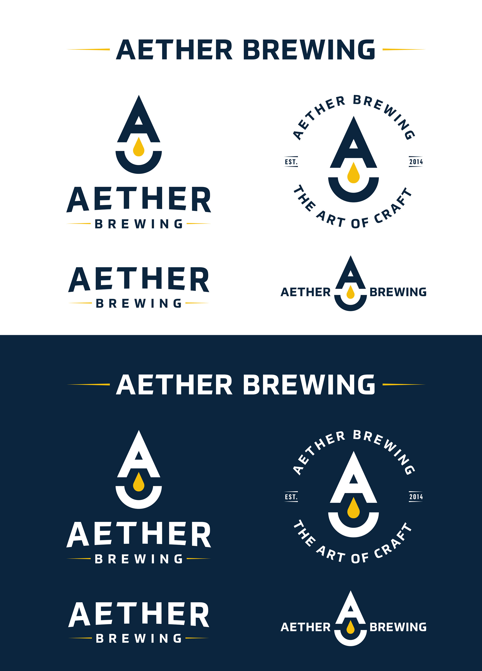
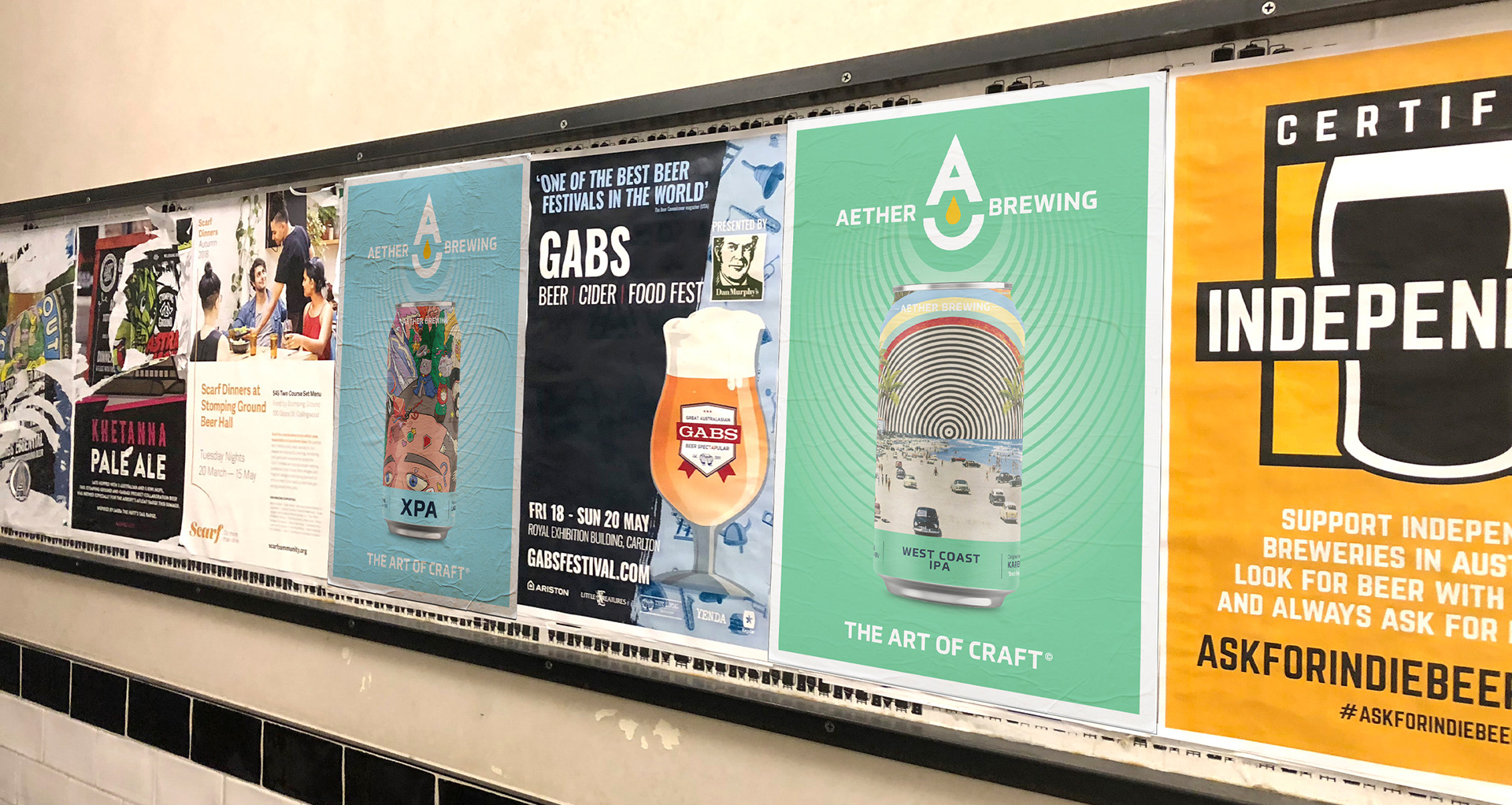
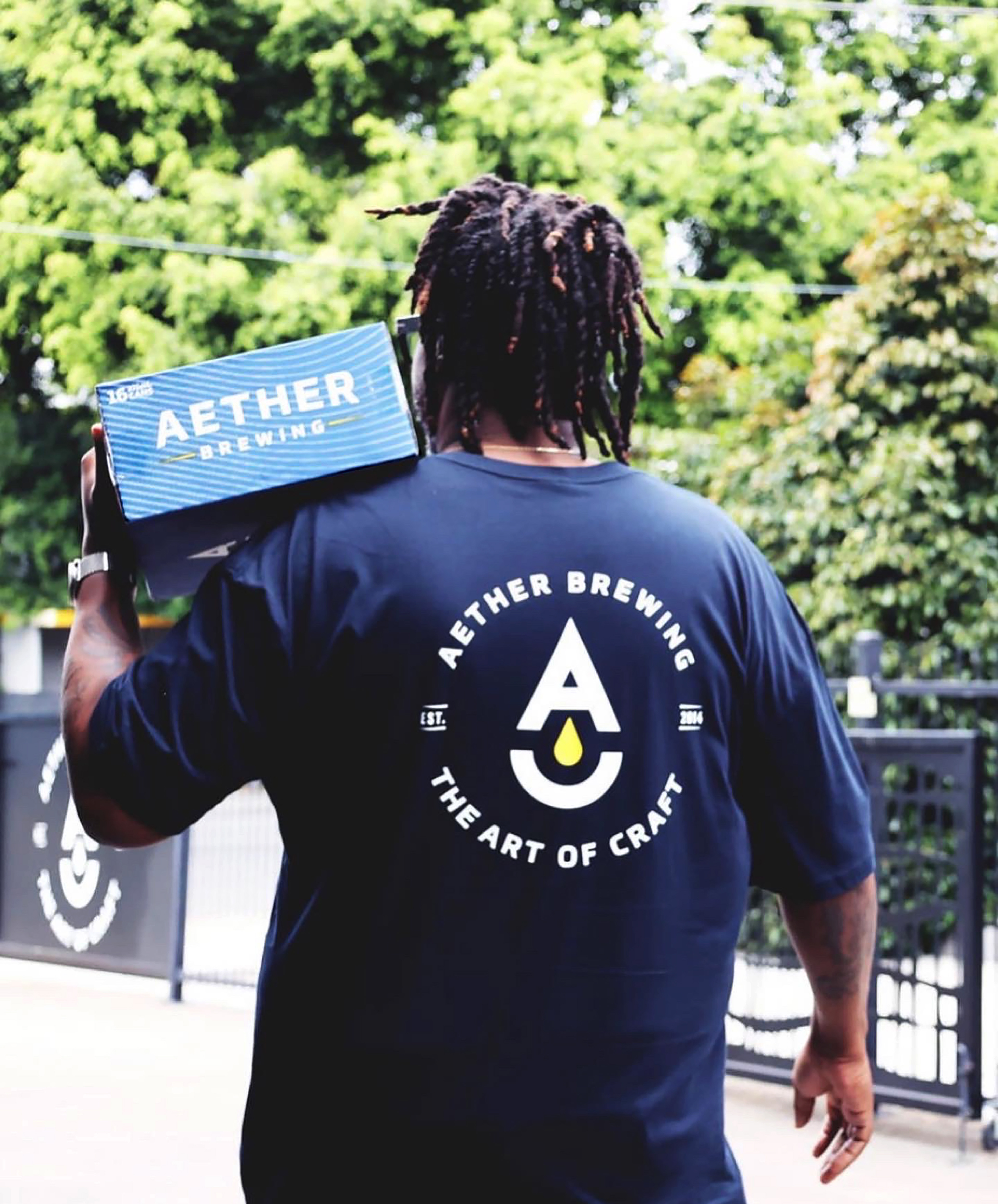
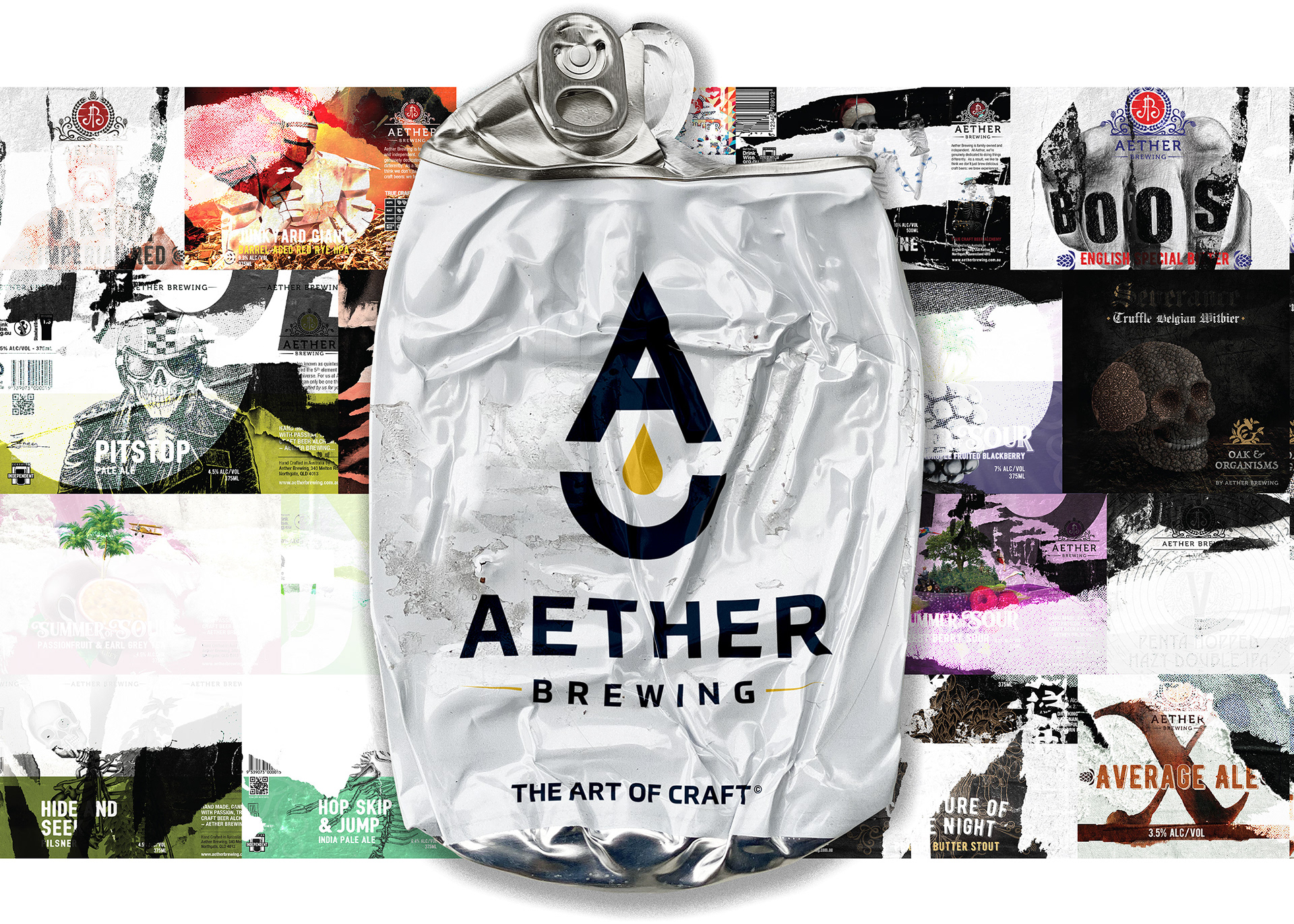
We teamed up with Aether Brewing to create a fresh logotype and identity system that truly reflects who they are. Inspired by the notoriously mispronounced silent 'A' in “Aether,” we brought to life the idea of “The Fifth Element”—that cherished amber nectar all beer lovers crave—while playing up the negative space to capture a droplet suspended in space within the main logo mark.
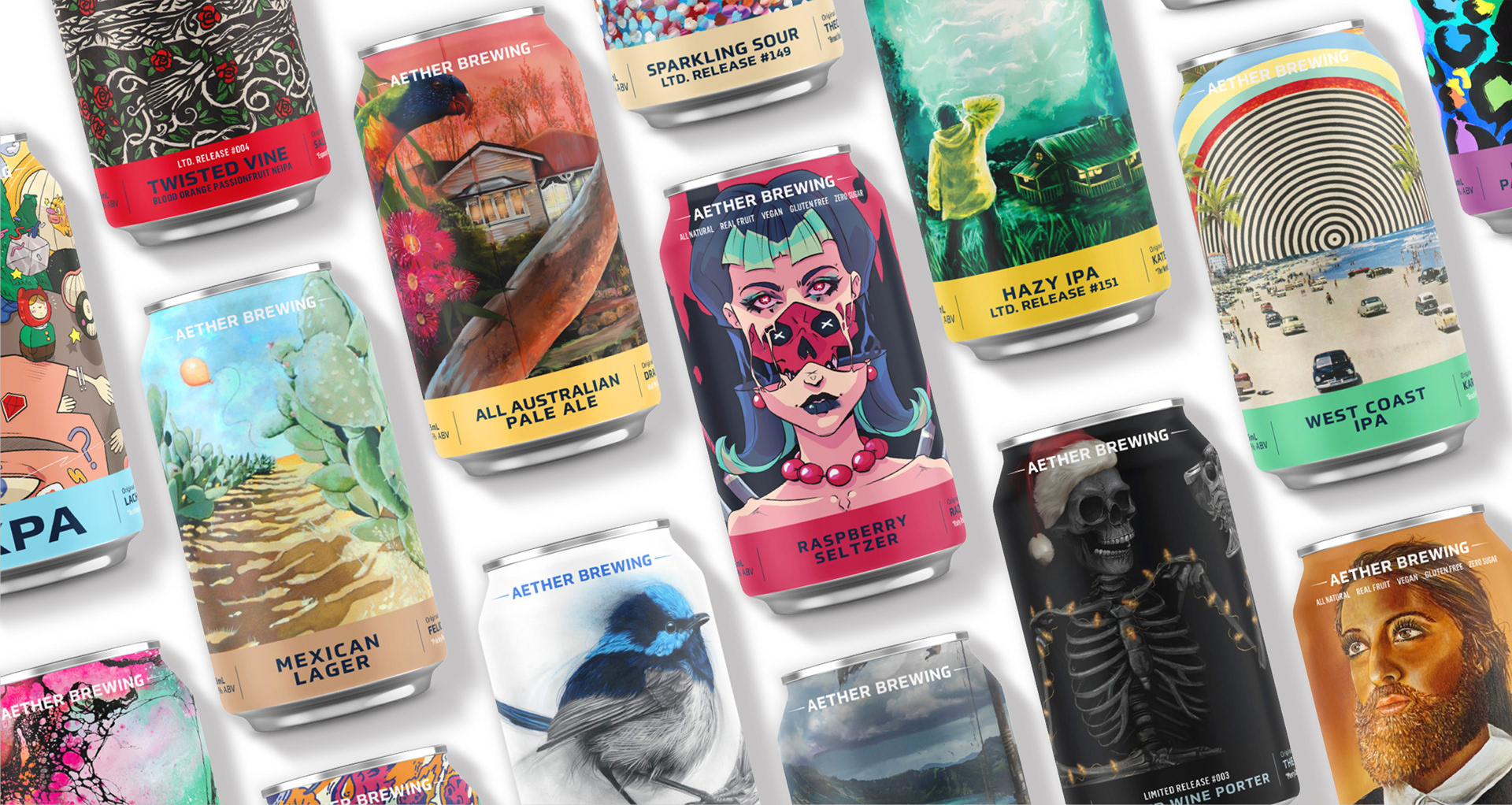
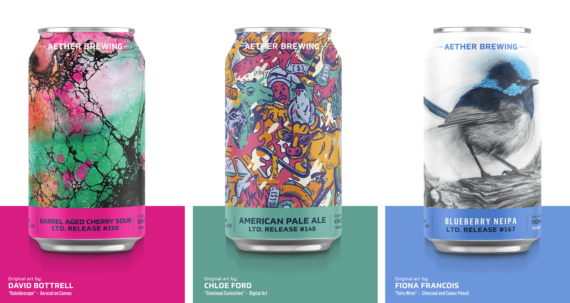
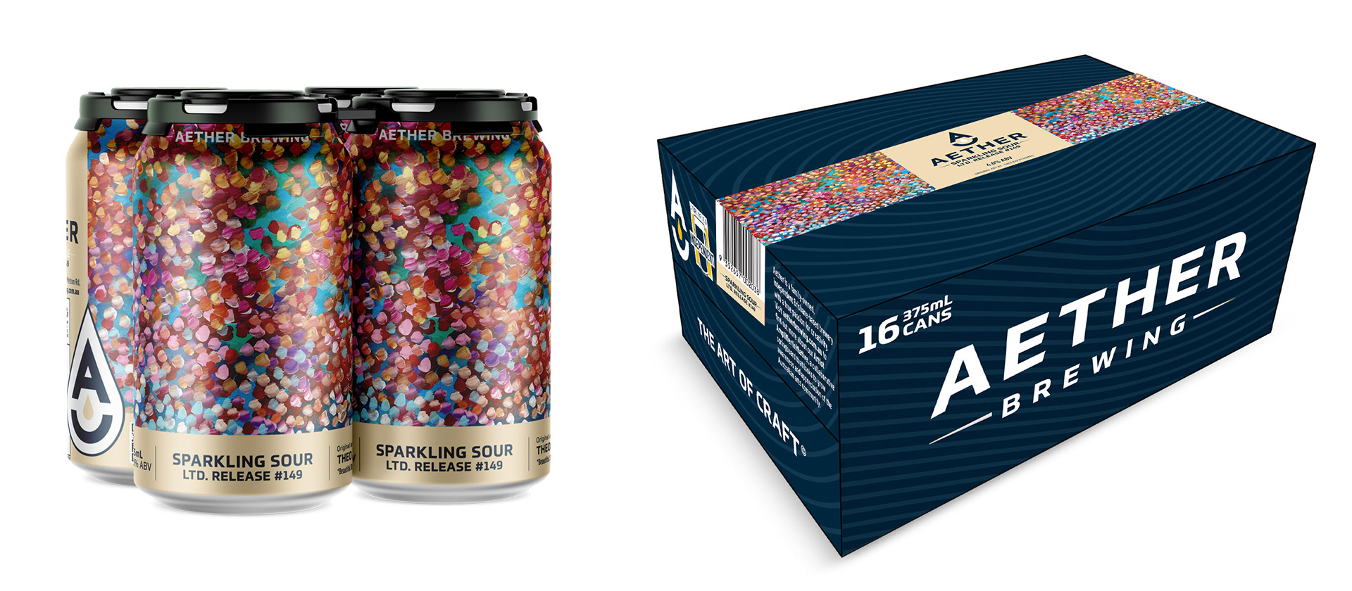
Aether Brewing also launched its Artist Amplifier Initiative in line with this brand refresh. This initiative showcases local talented artists on their cans and packaging, highlighting Aether's creative spirit. Demographics developed a punchy tagline, “THE ART OF CRAFT,” to connect the two concepts and then set about designing all packaging and design templates to fit with the new Identity system making their beers truly eye-catching.
Overall, this was an incredibly fulfilling project to work on, and we are very proud to share the results with you.

SERVICES RENDERED:
LOGO DESIGN / IDENTITY DESIGN / MERCHANDISE / PACKAGING / POS / TAGLINE CREATION / DIGITAL ART
LOGO DESIGN / IDENTITY DESIGN / MERCHANDISE / PACKAGING / POS / TAGLINE CREATION / DIGITAL ART